Review: The Best Interface is No Interface

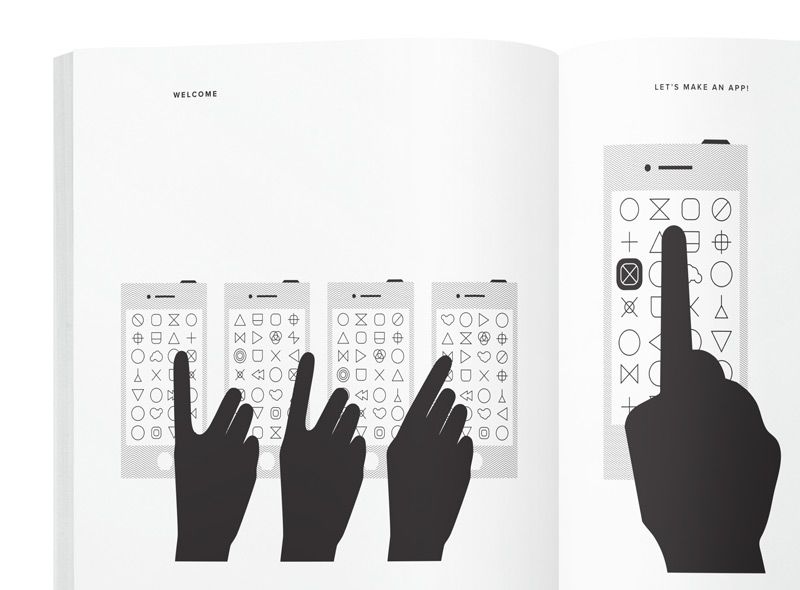
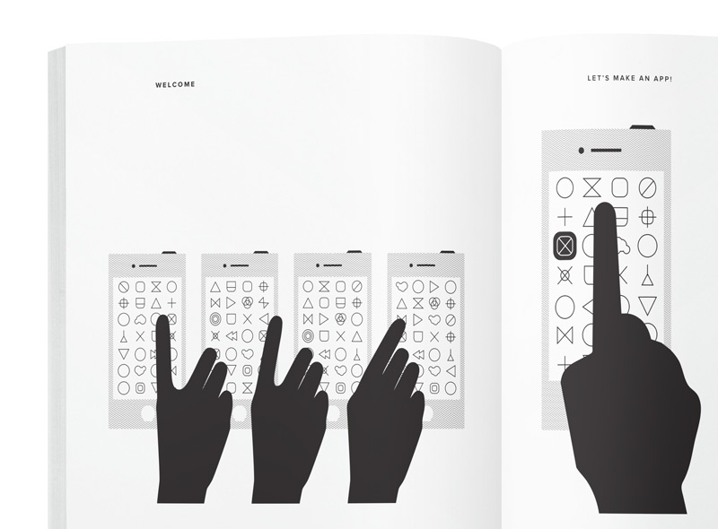
Several years ago, I read this post and was inspired to write a post of my own, excited about the potential of an interfaceless world. I was recently privileged enough to get an early read of Golden Krishna’s full-length book, “The Best Interface is No Interface.” Since reading it, I’ve found myself questioning the screens and technology around me, and if you read it, you will too. Humorous, pragmatic, and at times frightening, “The Best Interface is No Interface” is a must read for designers, developers, and entrepreneurs.
The book is a refreshingly honest step-back from our screen-obsessed, dopamine-fueled culture. As a subject matter expert in the field of user experience design, Krishna’s points are well-developed and draw heavily from case studies and recent industry research. At its core, the “The Best Interface is No Interface” is a call to action where Krishna invites the reader on a journey to explore a new paradigm for innovation and user experience.
Central to Krishna’s message is the idea that NoUI produces a superior user experience. By rethinking software without the constraints of a screen, designers can focus on solving problems more efficiently. For designers and innovators, screens have become a crutch. It’s easy to limit one’s creativity for web-based solutions to one’s own experience – that is to say, inside a screen. Rather than having the freedom to rethink user experience, brilliant minds are confined to making solutions for literal boxes. Often our thinking is confined to, “Let’s build an app for that” or “Let’s create some slick wireframe for that idea.”

Krishna asks a critical question, “what if the device could solve the problem without ever leaving your pocket?” This line of thought emphasizes contextually aware devices that aren’t dependent on user input. As the internet of things has generated more hype, smartphone apps are popping up everywhere for managing home security, door locks, lights, etc.. The problem with many of these applications is that they depend on users interacting with the screen.
Let’s say there’s a new app for turning off the lights in your home. You walk out of a room and remember that you didn’t turn the lights off. How would a typical app work?
1. Walk out of the room.
2. Take the phone out of your pocket.
3. Wake it up.
4. Swipe to reveal the password screen.
5. Input your password.
6. Exit any app that’s running in the foreground.
7. Locate the application you want.
8. Wait for the app to load.
9. Navigate through the app-specific tasks.
10. Swipe, tap, click, and/or type to turn off the lights
Comfortable with the status quo, we’ve grown to accept user-input based platforms as the only way. The platform waits for you to tell it what to do. “The Best Interface Is No Interface” emphasizes rethinking software in NoUI ways. This includes a fundamental shift from machines simply reacting to our input, to proactive devices that monitor and predict our needs. Rather than waiting for the user’s input, the device anticipates your needs through contextual awareness.
Innovations in big data, NFC, Bluetooth 3.0, and other sophisticated sensors make this possible today. Aided by leaps in machine learning and big data analysis, a new generation of tools will make contextual proactive systems possible. Several companies are already designing machine-input driven services: NEST, IFTTT, and Lockitron to name a few.
If we were to reimagine the application above as a contextually aware system, it might look something like this:
1. Walk out of the room.
2. The lights turn off.
Among the most interesting points in the book is Krishna’s discussion of the capitalist motivated shift from user first thinking to shareholder first thinking. When a company goes from being privately held to a public corporation, there is a fundamental shift in the company’s mission. While the private corporation had a mission of placing the user first, the public company has a duty to maximize shareholder value. Executives face a dilemma. If keeping shareholders happy comes at the expense of decreasing user experience, which should they choose? Their job security likely depends on appeasing shareholders. Thus for the public company, the duty to the shareholder trumps duty to the user.
So how are tech companies currently maximizing shareholder value? Most monetize user’s eyeballs for ad revenue. Higher page views + longer visits = greater profits. How do they get users to stay longer and come back more frequently? The answer lies in simple neurochemistry. Giant screens, retina displays, bigger images, interactivity, parallax, larger buttons, strategic color choice, typography, story telling… all force your brain to dump dopamine which create a feedback loop of addiction. By tailoring an experience that works on the brain’s dopamine pathways, a platform can ensure that users come back frequently and stay longer. Users come back more frequently and stay longer for that dopamine fueled warm fuzzy feeling.
Recent stats are frightening. On average, we spend 8.5 hours in front of screens each day. I’m sure this figure will rise with the surge in wearable tech. Even more startling are recent studies that reveal how many times individuals check their phones each day – as many as 150 times per day.
Krishna asserts that designers have a duty to solve problems efficiently through user-centered thinking. A user-focused designer might ask, “How can we present the user with relevant content in the most efficient manner possible?” The profit motivated flip-side to that question would be, “How do we present the user with information to ensure that they stay longer and come back regularly?” Thus the goal shifts to draw users to the page for longer, the opposite of efficient user-centered design thinking.

Krishna notes that user experience and turning a profit are not mutually exclusive. He explains that our job as designers and entrepreneurs is “to make a profit by providing you something that enhances your life in the most seamless and wonderful way possible.” I completely agree with this statement. Profits aren’t bad. Quite the opposite, fiscal rewards are a necessary incentive for spurring innovation. I own technology stocks and as a shareholder I want to see returns on my capital, but short-term profits are not as desirable as long-term, authentic innovation.
The principles of NoUI are centered on designing the most elegant user experience; however, the book is clear to point out that there are situations where a screen is absolutely necessary. Krishna doesn’t suggest abandoning our TVs for audiobooks. The overall aim of NoUI is to move beyond screens by designing a more personal, efficient experience. If nothing else, reimagining software as interface independent allows us to escape our screen-constrained boxes. The principles of NoUI coupled with advancements in technology make this an exciting time to be in the field. If you have any interest in technology or if you read this blog post from a screen, then do yourself a favor and check Golden Krishna’s “The Best Interface is No Interface” today!

