The Best Interface Is No Interface.
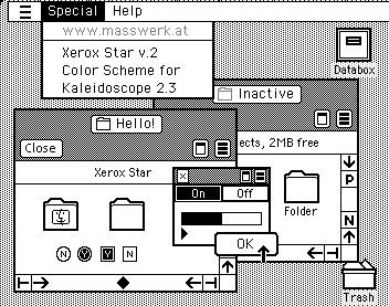
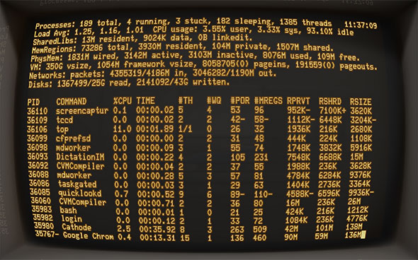
For years, human computer interaction was limited to a blinking cursor and the cathode glow of the command line interface.
Xerox changed the game with the first graphical user interface, and Apple followed suit with its own black and white GUI for the 1984 Macintosh.
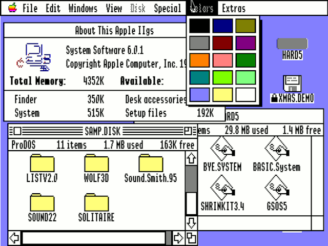
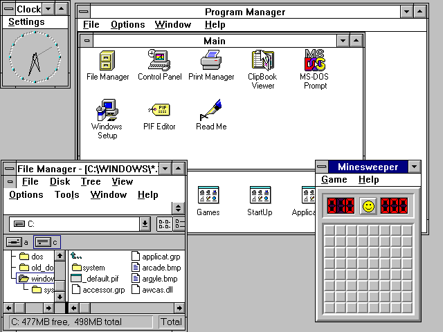
By 1988, computers sported higher resolutions, touch screens, and the first colored UIs.
The Apple II led the way (above), and Windows followed shortly thereafter with Windows 3(below).
I’m fascinated by the parabola-shaped development of the user interface. The rise of technology pushed the GUI away from its minimalist beginnings to an amalgam of shadows, texture, and color. Apple’s skeuomorphic calendar, complete with faux leather stitching, strikes me as the pinnacle of interface realism. For more on skeuomorphism vs. flat design, see this post.
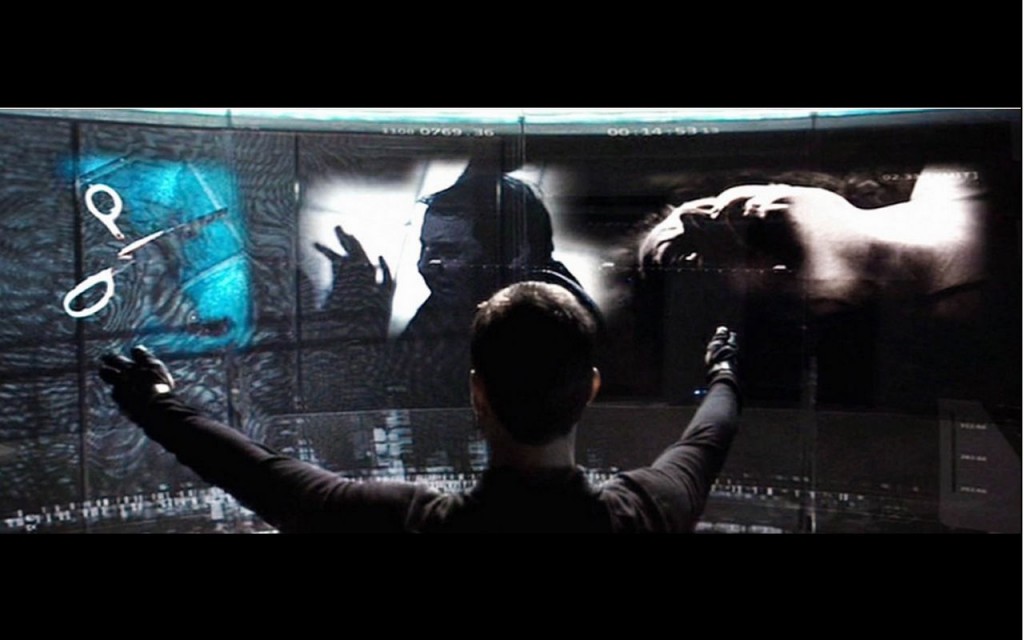
I have always been captivated by those futuristic interfaces from SciFi movies (see Minority Report above). As I’ve studied cognitive load, I’ve become more aware of my own difficulties interacting with an endless supply of complex dashboards. Now, I’m more a believer in the theory that “The Best Interface is no Interface.”
This brilliant article imagines a world without the graphical user interface by providing an analysis of where GUIs falls short. Just read it. You’ll thank me later.

